It’s been so long since I’ve done a new
NYComix, I figured I’d bring something a little extra to the table with the latest comic.
The best part of this “Making Of” is that I’m not sure how it’s going to turn out. I’m experimenting with a few different things, which I’ll get into as we go along.
First a little background on this NYComix “One Shot”.
If you haven’t checked out any of the earlier One Shots,
head on over here. The premise behind these comics is that they are one-page, one-panel comics. You could call them splash pages… a full-page a shot… whatever floats your Fanboy-Boat.
As with all my NYComix, they’re all-true comics about my various New York City moments. What separates the One Shots from the longer, sequential NYComix is that every one is a word-by-word account of what happened. Each comic is a real snippet of conversation, and when I’m lucky enough to hear one that piques my interest, I quickly jot it down in my little notebook right on the spot.
The characters and settings are reproduced to the best of my ability. This particular setting is the steps of the St. Patrick’s Cathedral on 5th Avenue, I took some shots of the Cathedral with my digital camera and the characters themselves are represented as I remembered them. I didn’t take a picture of this guy, as I was too disgusted with what he said. Plus, it’s probably not even legal to take a picture of someone for reference for reproduction in a comic without his/her consent. (Blah, blah, blah legal stuff I don’t care about, so I just go by memory to save myself the trouble.)
Now to the actual page.
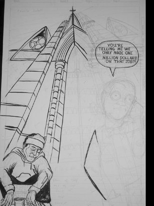
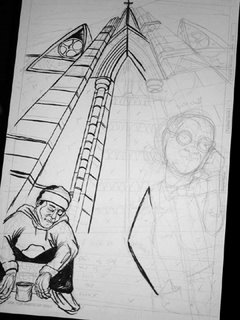
PENCILS
First step are the pencils. Which are pretty rough. I rely more on my inks to get the shadow, depth and texture I’m looking for. I found that doing that with a pencil, only to ink over it later is a waste of time. I’m also giving all the One Shots a similar composition. This will likely change later on, but for now, I’m kinda digging that idea.
INKS
Inking is done with the usual suspects. Higgins Black Magic Ink and a Windsor & Newton Sable brush. I use a Size 0 for the small stuff and a Size 3 for the bolder areas. I try to start going left to right, so as to not smudge the inks. This doesn’t always work, however, but I can always fix it in PhotoShop.
I’m still not sure where I’m going on the texture of the Cathedral. I’m going to use a lot of black in the shadows, but the hatching on the stones is still up in the air. I might have to do a little research and find some good pictures of the texture of stone buildings. In the meantime I’ll ink as much of this as I can before I move on to my first hand lettered balloon.
LETTERING
I’m seriously considering switching to hand lettering. The more I look at the computer lettering on my old stuff, the less I like it. The style works for superhero books, but for what I’m doing, it doesn’t match up. It’s real slick and computer looking while my art is loose inks and crosshatching. Plus I use one of Chris Eliopoulos’ fonts, and while I’m lucky enough to have access to fonts made by the best letterer in the biz. It’s not my work.
While I like to hand letter, it’s a time consuming process and adding more time to an already erratic schedule with my comics is something I don’t want to do. Another option is making a font of my lettering and drawing the balloons in illustrator. That way I can play with them, duplicate and resize as necessary, etc. In the meantime, this is a 2-balloon page so hand lettering takes no time at all. I’ll have to tweak some of the lettering if Photoshop, but only to center the type.

SHADOWS AND BRUSH FINISHES
With the lettering done I can finish up inking the shadows and bigger areas with the brush. Earlier I mentioned that I was going to try to add more texture to the stones, but as I saw the page coming together, I realized that it would be overkill. I think it works fine as is. Also, after I finished the page, I realized that I left out the “Wait” balloon. So I did that on a separate page and pasted it on the board.
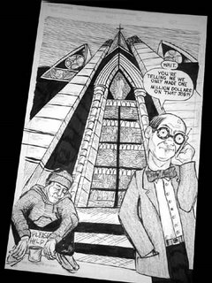
So there it is, the finished page. I’m going to add a little Title to the top left in Illustrator and that’ll be that.
Head on over here to see the finished product and please write with any comments, questions and if you’re a fellow comic creator feel free to drop some tips and/or suggestions.
Thanks!
--Randy